How to Plot Interaction Effects in SPSS Using Predicted Values
So you've run your general linear model (GLM) or regression and you've discovered that you have interaction effects (i.e. moderating effects). Now what? Next, you might want to plot them to explore the nature of the effects and to prepare them for presentation or publication! The following is a tutorial for who to accomplish this task in SPSS. A follow-up tutorial for how to do this in R is forth coming.
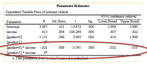
To demonstrate this task I'm using one of the sample datasets that comes with SPSS named "demo_cs.sav". To start let's assume that we've already found an interaction effect (see figure below). In this case, we've run a model in which income and gender are predictive of the price of one's vehicle. The figure below also shows us that income and gender interact to predict price of one's car (p<.001), so we have an effect to explore/plot!
The significant interaction term indicates that there is a moderating effect to explore graphically!
As you may or may not know, the above analysis can be run using either the GLM menu dialog or the regression dialog in SPSS. A key difference between the two is that you'll need to manually create the interaction term using the regression method, whereas the GLM will allow you to specify the interaction in the "Model..." dialog (see 1 in figure below).
Click on the "Model..." button to specify main effects and interactions in a Univariate General Linear Model (GLM). Click on "Plots" to produce effect plots, but this only works for categorical/binary predictors (Fixed Factors). How do you do this when a predictor is continuous? Read on...
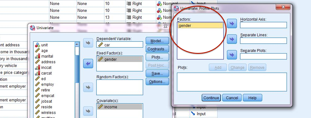
In the GLM dialog (above) you might've also noticed that there is a "Plots" button that you can click (see 2 in figure above), which seems promising, except you may be disappointed to find that it is only helpful if both predictors are binary or categorical (Fixed Factors in Univariate GLM). If either of the predictors in the interaction you wish to explore graphically are continuous (Covariate in Univariate GLM), then that predictor won't be available to create a plot in the "Plots" dialog (see figure below).
Only the "Fixed Factor(s)" predictor is available in the "Univariate: Profile Plots" dialogue
To obtain the plot you are seeking when one of your predictors is continuous (Covariate in Univariate GLM), you simply need to save your predicted values during analysis and plot them using "Graphs > Legacy Dialogs > Scatter/Dot...".
Let's walk through our example. Whether you used the GLM - Univariate analysis or the Regression - Linear analysis the first step is the same: return to your analysis dialog and click on the "Save..." button (GLM - Univariate example on left below, Regression-Linear example on right below).
Click "Save..." and then click on the "Unstandardized" box in the "Predicted Values" options.
Click "Save..." and then click on the "Unstandardized" box in the "Predicted Values" options.
After re-running your analysis while saving the predicted values, you will find a new variable in your dataset named "PRE_1" (which stands for "Predicted Values"; see figure below).
NOTE: each time you re-run this analysis a new version of this variable will be created with a new numeric postscript...PRE_2, PRE_3...etc). You will use this new variable to plot your effects.
Next navigate to "Graphs > Legacy Dialogs > Scatter/Dot..." (see figure below).
Graphs > Legacy Dialogs > Scatter/Dot...
Once in the "Scatter/Dot..." dialog, move the newly-created predicted values variable (PRE_1) to the Y-Axis (predicted value for price of car in our example), your continuous predictor to the X-Axis (income in our example) and your categorical variable (gender in our example) to the "Set Markers By" field (see figure below). When done (set "Titles" and change "Options" as desired), click "OK".
Plot "predicted values" from regression or Univariate GLM to explore interaction effects.
You now have your plot, but you'll probably notice immediately that you are missing your trend/regression lines to compare your effects (see figure left below)! We need to make some slight modifications here. To add these lines: double click on the plot in the output viewer (or right click and choose "Edit Content > In Separate Window"). Once your new plot editor window appears (circled in figure center below), click on the "At Fit Line at Subgroups" button.
Upon clicking on the "At Fit Line at Subgroups" you should now see your trend lines for each group (i.e. moderator group; our example has only 2 groups, but this would work the same if there were more than 2 groups).
Initial plot from "Scatter/Dot..." dialog. We need to add trend/fit lines to make interpretable.
To add the trend/fit lines, click on the "At Fit Line at Subgroups" button (circled in red above).
To delete the R-squared text, simply click on the text and hit delete on your keyboard
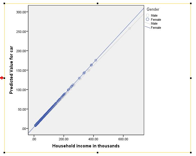
Next, I like to remove the text that appears indicating an R-squared statistic for each group's trend line (see figure center above). I don't find this enormously helpful, so typically delete it (see figure right above). To delete the R-squared text, simply click on it to select (will be outlined in yellow when selected) and press the delete key on your keyboard (see figure right above). You are now done editing your plot. Close your "Chart editor" dialog and your new plot should now be visible in your output viewer (see figure below).
We see above that the interaction effect in this example is not large, as the difference in slopes between males and females is not huge, but according to the initial analysis the difference in slope is statistically significant.
If you wish to make the plot black and white, instead of color (differentiating groups by line type, per APA format), check out my blog on making SPSS automatically create APA formatted plots! Otherwise, thanks for reading and feel free to leave a comment/provide feedback below!
NOTE: observations are not typically as neatly placed along the fit lines as they are in our example above, but in this example from SPSS sample data the predictors explain over 90% of the variability in our dependent variable (very rare in real life analyses). Typically, you will see many observations straying away from the trend lines.


