Within-person (or within-subject) effects represent the variability of a particular value for individuals in a sample. You see this commonly examined in repeated measures analysis (such as repeated measures ANOVA, repeated measures ANCOVA, repeated measures MANOVA or MANCOVA…etc). In these instances, a within person effect is a measure of how much an individual in your sample tends to change (or vary) over time. In other words, it is the mean of the change for the average individual case in your sample.
Read MoreFormatting a graph that was exported from SPSS to Microsoft Word can be an absolute pain. Since neither program is known for it's simplicity or "user-friendliness", the interaction between the two can be predictably tedious and frustrating. The process of converting a standard SPSS table to APA format might be bearable, when you are talking about a single table, but can become overwhelming when you have an entire manuscript worth of tables. Fortunately, a few minor alterations to your SPSS settings can make SPSS do most of the heavily lifting for you, making SPSS automatically produce tables that closely resemble APA format and cutting down your formatting time by as much as 90%!
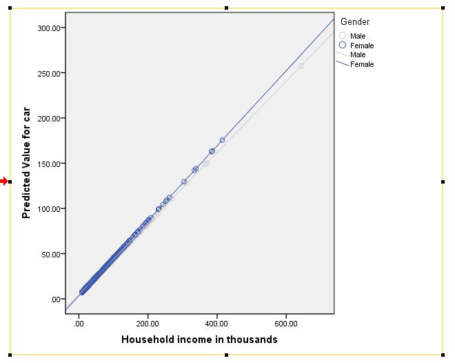
Read MoreSo you've run your general linear model (GLM) or regression and you've discovered that you have interaction effects. Now what? Next, you might want to plot them to explore the nature of the effects and to prepare them for presentation or publication! The following is a tutorial for who to accomplish this task in SPSS. A follow-up tutorial for how to do this in R is forth coming.
Read MoreIn the strictest sense, APA style discourages the use of color in graphics, stipulating that it be used only when it is "absolutely necessary". Consequently, most universities and dissertation committees also discourage (or downright forbid) the use of color graphics in dissertation manuscripts. Personally, i find this irritating, as I think most graphical representations of data can be made more clear with the appropriate use of color. However, I suppose the guideline is meant to provide uniformity and consistency across manuscripts, which is understandable.
Unfortunately, if you use SPSS you've probably already discovered that it produces graphics in color by default. Not to worry, your graphs can be changed easily. Better yet, you can make simple adjustments to your SPSS settings that will force the program to create APA-compliant (i.e. black & white) graphics in all output! Here is how you do it...
Read MoreIn today's blog entry, I will walk through the basics of conducting a repeated-measures MANCOVA in SPSS. I will focus on the most basic steps of conducting this analysis (I will not address some complex side issues, such as assumptions, power…etc). If you find yourself with lingering questions after walking through this blog, feel free to leave questions in the "comments" section, or visit the MANCOVA section of my discussion forum to find answers and/or ask questions of your own. Full disclosure: the example data used is from the SPSS sample/help files, and it can be downloaded below...
Read MorePreparing a dataset for analysis is an arduous process. Besides recoding and cleaning variables, a diligent data analyst also must assign variable labels and value labels, unless they choose to wait until after your output is exported to Microsoft Word. Unfortunately, that option only leaves additional opportunity for error and confusion, not to mention the inefficiency of editing tables in Microsoft Word...
Read MoreWhile there is no "magic bullet" to make stats and data analysis easy to understand and helpful in our research, there are some things that you can do to avoid pitfalls and help things run smoothly. This "top ten" list offers a few of those things that I think you will find helpful! I'll be posting a video of this list later today on my Stats Videos page.
Read More


